Most birthday invitation backgrounds aren’t filed under “birthday” at all — a lot of the strongest options come from the wedding and general invitation categories, since a soft watercolor wash or a clean floral frame works just as well for a milestone birthday as it does for a bridal shower. The 24 backgrounds below are ranked by how often other buyers have saved each one, from a gaming-themed set at the top down to a handful of untested new releases.
This invitation background library adds new designs every week, spanning watercolor florals, abstract washes, and themed illustrations. Every file here is delivered print-ready at high resolution, and most come as editable vector files you can recolor before adding your own text.
See also: birthday invitation card for kids.
Quick Answer: This guide covers 24 birthday invitation backgrounds — watercolor florals, abstract washes, and themed illustrations — ranked from most-saved to least-saved. Each file is a print-ready digital download you can drop your own text into.
The most-saved background in this list is a gaming-themed set, not a floral one — a reminder that a background built specifically for a birthday party, even a niche one, tends to outperform a generic wedding-style floral repurposed for the occasion.
All files below are digital downloads. Open the vector or JPG in your editor of choice, add your party details, and print at home or through a local shop. The list runs in order of popularity, so the top few are what other buyers have saved the most.
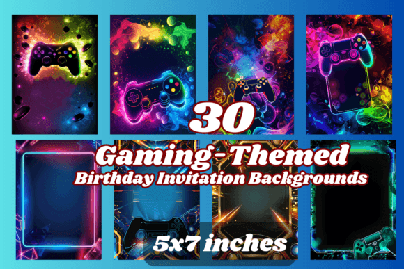
1. 30 Gaming Birthday Invitation Background
A set of 30 gaming-themed backgrounds with room left blank for your party details, formatted to 5×7 inches so it drops straight into a print job or a digital send.
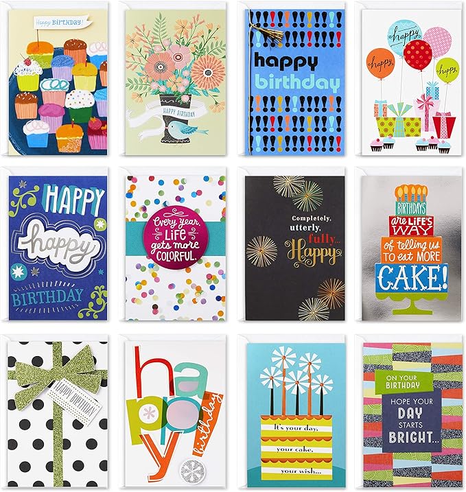
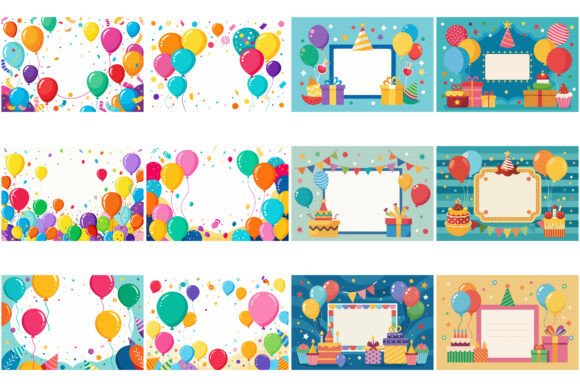
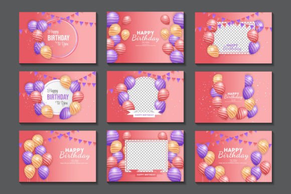
2. Birthday Party Invitation Card Bundle
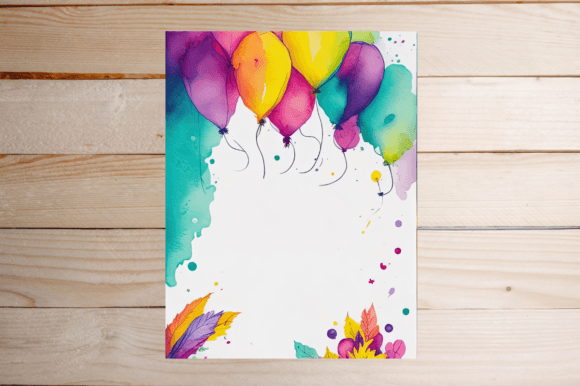
A vertical frame built around colourful balloons and confetti with an empty white panel in the center — comes as a bundle of 12 EPS and 12 SVG files plus matching JPGs.
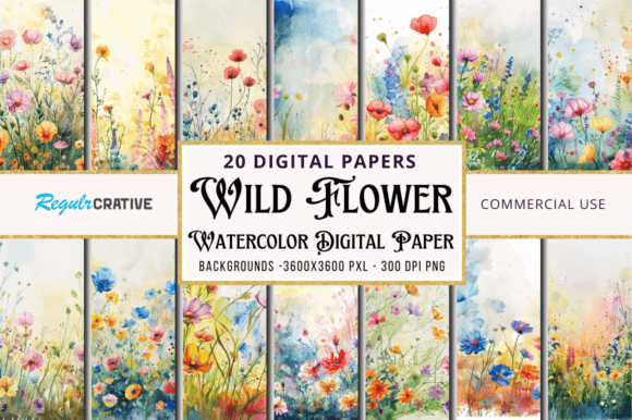
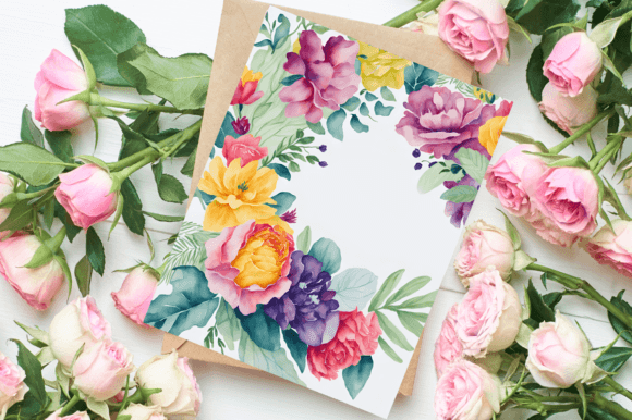
3. Wild Flower Watercolor Painting Papers
Twenty floral digital papers at a full 12×12 inches, 300 DPI — less a single background than a library you can crop down to whatever card size you need.
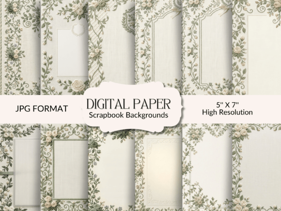
4. Sage Green Wedding Invitation Background
Twenty-four sage green and cream backgrounds with soft floral accents in the corners, delivered as ready-to-print 5×7 JPGs.
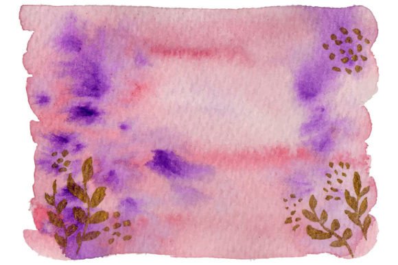
5. Wedding Invitation Background Template
A hand-painted watercolor floral wash in soft tones, supplied as an editable EPS vector so the colors and layout can be adjusted before printing.
6. Wedding Invitation Background Watercolor
A second watercolor floral background from the same artist, painted in a slightly cooler palette — useful if you want a matching set rather than a single design.
7. Lily Wedding Invitation Background
A single-sided background built around a lily motif, clean enough to hold birthday text as easily as its original wedding framing.
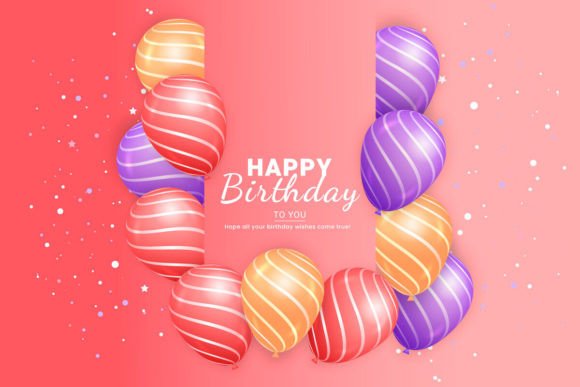
8. Birthday Wish Background Design Set
A “Happy Birthday” typography background with air-balloon illustrations, sized at 1920x1080px and supplied as an editable EPS.
9. Watercolor Invitation Card Background
A watercolor background featuring an illustrated cat couple, sized for A4 printing — a softer, more playful option than the florals above.

10. Wedding Invitation Background Template
A third variant of the hand-painted watercolor floral background, warmer in tone than the first two in this set.
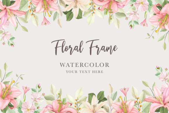
11. Watercolor Floral Wedding Invitation
A watercolor floral background delivered across four formats (AI, EPS, JPG, PNG) for whichever software you’re editing in.
12. Pink Violet Abstract Painting Watercolor
An abstract wash in pink and violet tones, less literal than the floral options and easy to drop birthday text over without competing for attention.
Browse All Invitation Background Designs →
13. Watercolor Invitation Card Background
A second watercolor cat-couple background matching the styling of the A4 print above, useful if you want to offer two similar options side by side.
14. Invitation Design Background
A wedding-ornament style background with a single vector illustration and a clean text area, delivered as one EPS and one JPG.
15. Wedding Invitation Background Watercolor
A fourth hand-painted watercolor floral variant, rounding out the same artist’s series with its own distinct color mix.
16. Watercolor Invitation Card Background
A third watercolor cat-couple background in the same A4 series, this one with a slightly different color balance.
17. Watercolor Invitation Card Background
A fourth cat-couple watercolor background from the same series, for anyone wanting more variety within that one illustrated style.
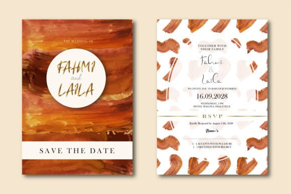
18. Brown Abstract Background Invitation
An abstract background in warm brown tones, plain enough to work for a milestone birthday as easily as a wedding.
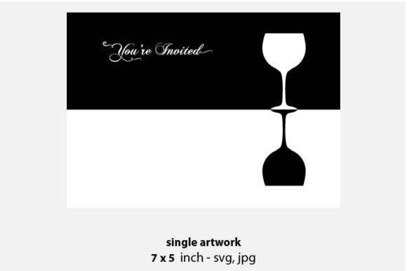
19. Wine Invitation Background
A wine-themed vector background at 12×12 inches — an unusual pick for a birthday invite, but the muted palette reads well behind bold text.
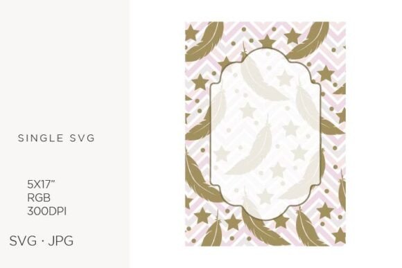
20. Feather Invitation Background
A feather-motif clipart background sized at 5×7 inches, light enough not to fight with a headline.
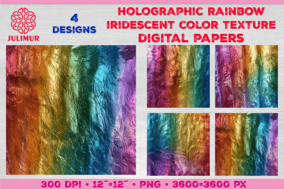
21. Holographic Rainbow Iridescent Paper
A set of four holographic rainbow digital papers at 12×12 inches — the most colour-saturated option in this list, better suited to a kids’ or teen invitation.
22. Elegant Watercolor Floral Wedding Card
An elegant watercolor floral background delivered across five formats, giving you the most editing flexibility of any design here.
23. Birthday Wish Background Design Set
A second “Happy Birthday” typography background with balloon illustrations from the same artist as the listing above, in a different layout.
24. Watercolor Invitation Card Background
A fifth and final entry in the watercolor cat-couple series, closing out the set with its own colour variation.
For more invitation styles, see our elegant birthday invitation templates.
Key Takeaways
- The most-saved background is a gaming-themed set built specifically for birthdays, not a repurposed wedding floral — theme-specific designs tend to get saved more often.
- Several of the strongest options here come from the wedding invitation category, since a soft watercolor or abstract wash works for a milestone birthday just as well as a bridal event.
- The watercolor cat-couple series and the stockmarket floral series each offer four to five near-identical variants, so you can pick a favorite colour mix rather than settling for one option.
- Only two listings in this set are typography-first “Happy Birthday” designs — most of the rest are plain backgrounds meant to hold your own text or photo.
Frequently Asked Questions
Can a wedding invitation background work for a birthday party?
Yes — most of the watercolor and abstract backgrounds in this list have no wedding-specific text or imagery, so they hold birthday wording just as cleanly as a wedding date.
What software do I need to edit these backgrounds?
Most files include an editable vector (AI or EPS) alongside a JPG or PNG preview, so you can open them in Illustrator, Canva, or any editor that supports those formats.
What size should I print my invitation at?
Most backgrounds in this list are formatted to standard 5×7 inch invitation size, with a few digital papers supplied at a larger 12×12 inches that you can crop down.
Which background is best for a kids’ birthday party?
The gaming-themed set and the holographic rainbow papers are the most kid-friendly options here, while the watercolor florals and abstract washes suit an adult or milestone birthday better.
Do I need to add my own text to these backgrounds, or is wording included?
Most of the plain backgrounds ship with no text at all, so you’ll need to layer on the party details yourself in Canva, Illustrator, or another editor. Only the typography-first “Happy Birthday” designs come with wording built in, and even those usually leave a blank space for the date, time, and location.