Birthday letter design ideas on Creative Fabrica split into three formats: die-cut and pop-up cards that fold from a flat sheet, printable stationery meant for reusable letter-writing rather than a single card, and flat postcard-style invitations. The 20 designs below cover all three, from a self-sealing cupcake envelope to a full set of fall-themed writing paper.
Creative Fabrica’s birthday letter and stationery library adds new designs regularly, and most listings below include SVG alongside AI, EPS, DXF, or PDF, meaning they open directly in Cricut Design Space, Silhouette Studio, or your design software of choice without extra conversion. See also: birthday letter to sister for wording ideas to pair with any of these designs.
Quick Answer: This guide covers 20 birthday letter and stationery designs — pop-up and die-cut cards, printable stationery sets, and postcard-style invitations. Each is an instant download, ready to print or cut, and suited for 2026.
A reusable stationery set is worth choosing over a single die-cut card when the letter itself matters more than the format — you get several sheets to write on instead of one card built around a fold or pop-up mechanism.
Most of these files need a home printer plus cardstock or heavy paper, while a handful of the die-cut and pop-up designs additionally need a Cricut, Silhouette, or fine-point cutting blade. Check each listing’s supply list before committing to a paper weight.
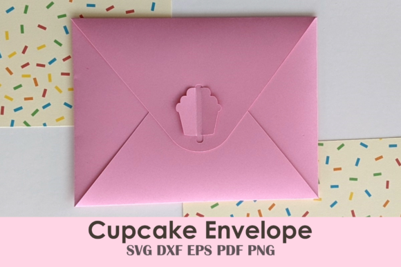
1. Cupcake Birthday Card Envelope
A self-sealing envelope that folds flat from a single US Letter sheet, with a die-cut cupcake shape forming the clasp that seals it closed. Includes a matching sprinkle-pattern digital paper for lining the inside, and files for both Cricut’s scoring tool and a pre-perforated fold option if you don’t have one.
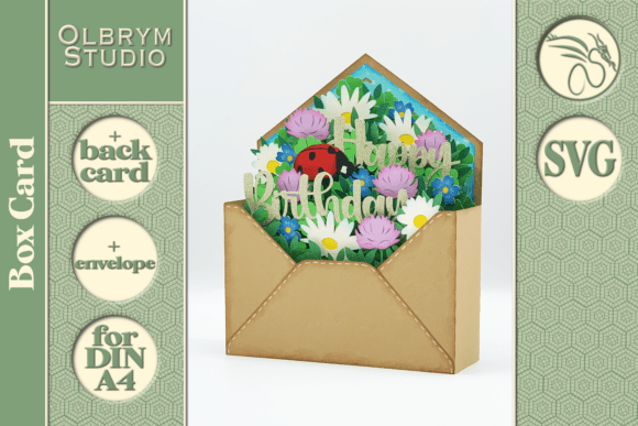
2. Good Luck Happy Birthday Letter Card SVG
A clover-shaped pop-up card where a leaf lifts open to reveal a ladybug surrounded by daisies, dandelions, and fern, with a built-in slot for tucking in a gift card. Sized at 16.8cm square with a matching envelope pattern, delivered as SVG files plus a PDF assembly manual.
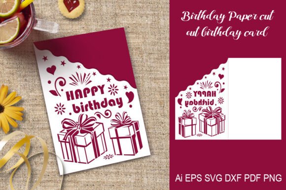
3. Paper Cut out Happy Birthday Card
A cut-out card template positioned on a US Letter sheet — fold in half after cutting the outlined elements and it’s ready to send. Delivered as AI, DXF, EPS, SVG, and PNG on transparent 300dpi backgrounds for whichever cutting method suits your machine.
Prefer something you can reuse for every birthday instead of printing a new letter design each time? A changeable letter board gives you that flexibility without losing the handmade, personal feel of these SVG cards.

4. Watercolor Letter Designs
Two watercolor letter graphics in transparent PNG format at 300dpi, useful for building your own monogram, logo, or invitation design rather than a ready-made card. A raw design asset meant to be dropped into your own layout.

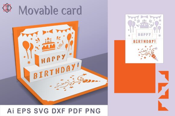
5. Movable Card Happy Birthday/svg Cut
A fold-out card with three-dimensional pop-up elements and cut-out festive shapes that add depth when opened, printed on heavy cardstock in a vertical US Letter template. Delivered as AI, EPS, SVG, DXF, PDF, and PNG with instructions for cutting outlines and folding the assembly lines.
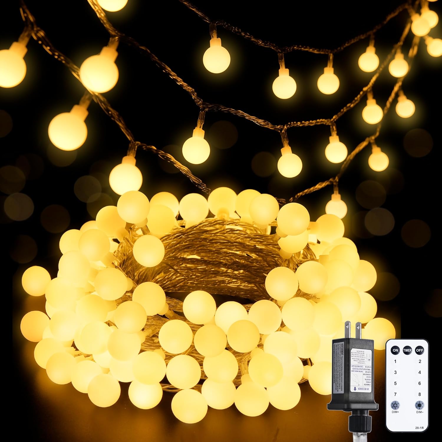
If a pop-up card like this one gets you thinking about photo displays, a set of mini string lights with clips is a simple way to turn your finished cards or party photos into a hanging display after the celebration.

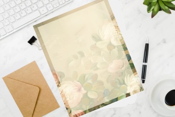
6. Watercolor Birthday Stationary Template
Six lined and unlined printable stationery sheets in one PDF bundle — three US Letter size and three A4 size — meant for reusable letter-writing rather than a single card. Print as many copies as needed from the one download.
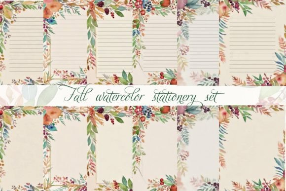
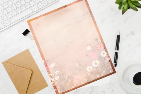
7. Fall Watercolor Stationery Set
A set of 6 fall-themed watercolor stationery styles with soft autumn botanicals, delivered as 6 JPG files plus one combined PDF at 300dpi. Suited to letters, notes, or birthday correspondence beyond a single-use card.
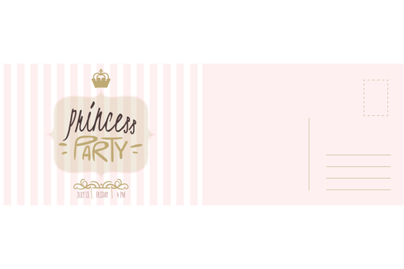
8. Party Invitation Card. Princess Birthday
A minimal postcard-style invitation with a gold crown on a pastel pink background, delivered as vector EPS and JPG files for a princess-themed birthday party. A flat card design without pop-up or fold elements.
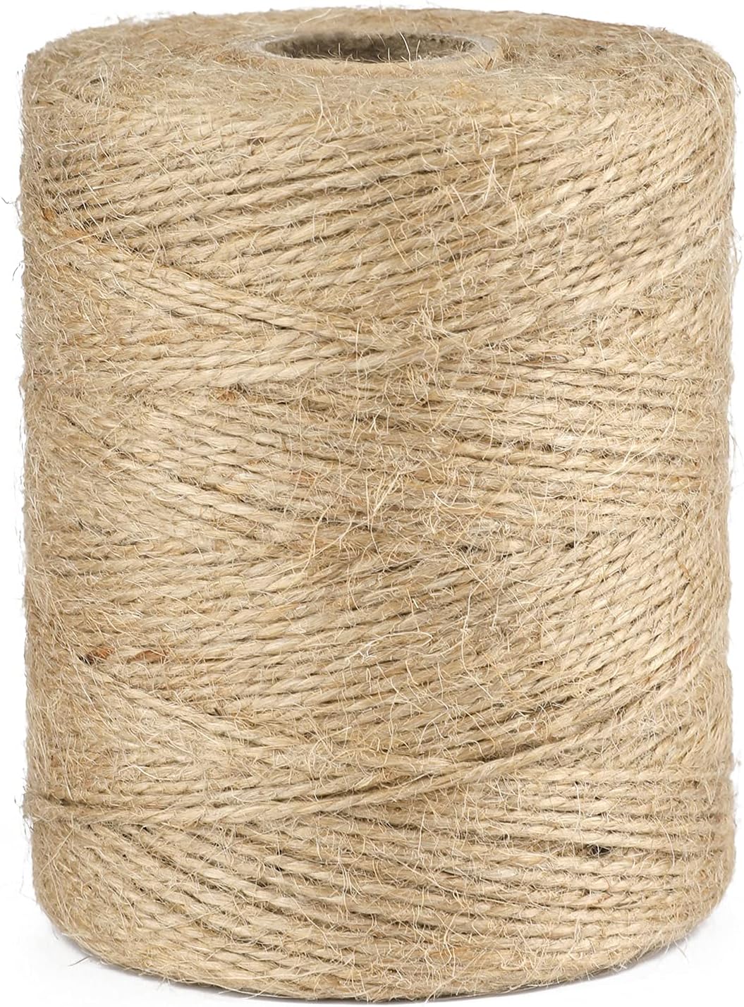
Postcard-style invitations like this one look even better paired with matching table decor. A jute twine roll is a cheap, versatile way to tie favor tags, bundle napkins, or hang a row of mini banners at the party itself.

9. Vintage Roses Stationery
A vintage rose stationery set with one lined and one unlined page at 300dpi, delivered as 2 PDFs in one zip file. An elegant, understated print-and-write option rather than a themed party card.
10. Printable Birthday Greeting Card PDF
A high-quality single-page PDF card sized to print at 5×7 inches from a US Letter sheet, left blank inside for your own message and meant for last-minute gifting. Just cut, fold, and add your own envelope.
Want to see more birthday letter designs? Browse All Birthday Letter Designs on Creative Fabrica →
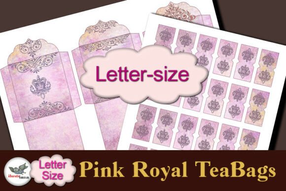
11. Pink Royal Tea Bag Set Letter Size
A printable tea bag and tag set in soft pink watercolor with ornate crown motifs, delivered as 2 JPG pages at 300dpi — one sheet of 3 tea bag envelopes and one matching tag sheet. Suited to tea-party favors alongside a birthday gift rather than a card itself.
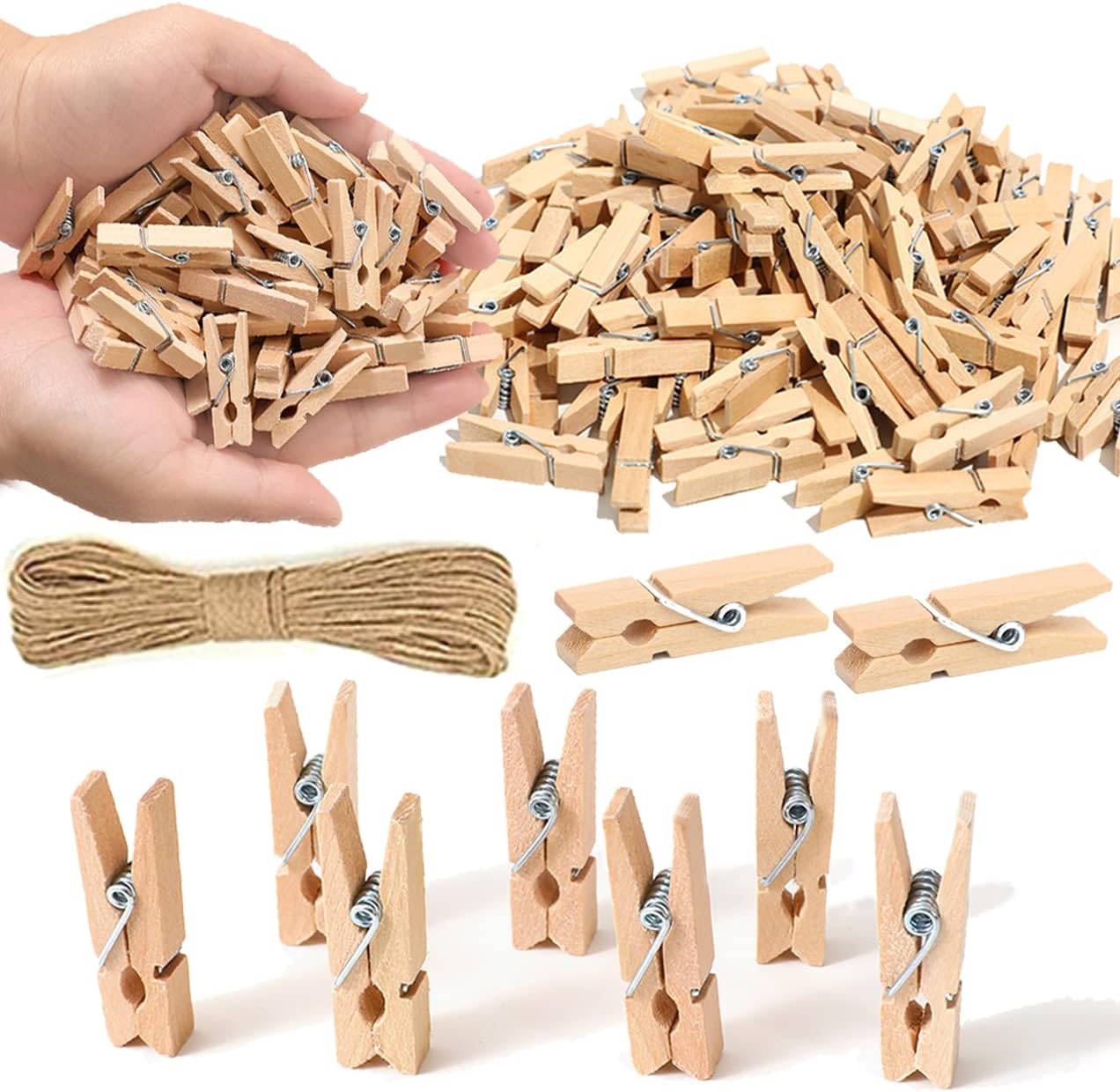
Once you’ve picked a stationery style, you’ll likely want to display a few finished pieces rather than tuck them all away in an envelope. A set of polaroid-style photo clips lets you pin a card or a party photo somewhere visible without any tape or pins in the wall.

12. Watercolor Birthday Card Printable
A 5×7 inch printable birthday card delivered as an instant digital download, sized to fold from A4 or US Letter paper with a separate envelope needed to complete it.
13. Vintage Daises Stationery
A vintage daisy stationery design meant for letters, thank-you notes, or birthday correspondence, delivered as a printable JPG download with a soft vintage color palette.
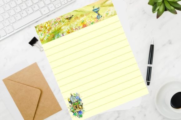
14. Yellow Garden and Birds Stationery
A yellow garden and birds stationery paper sized at 8.5×11 inches, delivered as a JPG in a zip file — a nature-themed sheet for letters or notes rather than a folded card.
A nature-themed stationery sheet like this one pairs naturally with a real polaroid-style frame — printing a photo alongside a handwritten letter makes the whole thing feel more like a keepsake than a one-off card.
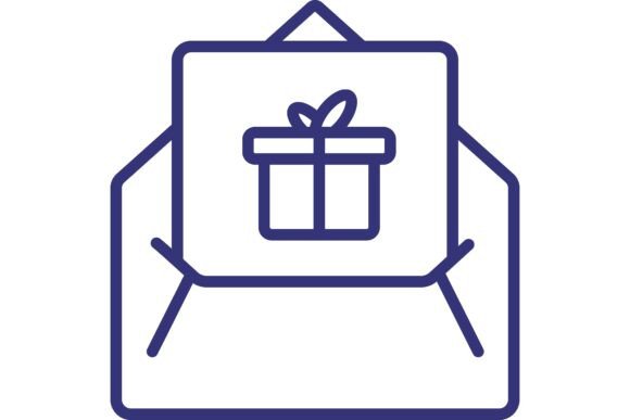
15. Gift Letter Line Icon. Birthday Message,
A simple line-icon graphic of a gift letter, suited to birthday-themed illustrations, social graphics, or small accent use in a larger design rather than a printable card on its own.
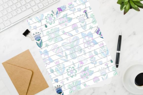
16. Purple Flowers and Bugs Stationery
A purple flowers and bugs stationery paper at 8.5×11 inches, delivered as a JPG in a zip file — a whimsical nature print for letters, notes, or birthday correspondence.
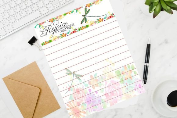
17. Rejoice Evermore Floral Stationery
A floral stationery design with dragonfly accents at 8.5×11 inches, delivered as a JPG in a zip file, suited to letters and cards needing an elegant, botanical background.
If you’re putting together a full birthday setup rather than just a single card, a ready-made banner and balloon kit saves you from designing decor from scratch — it pairs well with any of the postcard or stationery styles above.
18. Birthday Invitation Card. Princess Ball
A princess ball invitation card with a gold crown and calligraphy-style lettering on a pastel pink background, delivered as vector EPS and JPG files for a girl’s birthday party.

19. Happy Birthday Postcard. Holiday Card Wi
A postcard-style birthday card with golden and silver balloon illustrations and confetti, delivered as a 3D vector EPS and JPG design suited to a festive birthday greeting or invitation.

20. Happy Birthday Postcard. Holiday Card Wi
A second postcard-style birthday card from the same designer, this one featuring a llama character in a party hat surrounded by confetti, delivered as a hand-drawn vector EPS and JPG design for a children’s birthday greeting.

Assembly time varies by design — the flat stationery and postcard designs print and go, while the die-cut and pop-up cards need a cutting machine or blade plus time to fold and glue. Read through each listing’s instructions before starting if you haven’t assembled a pop-up card before.
For more ways to present a written note, see our birthday card holder designs.
Browse All Birthday Letter Designs on Creative Fabrica →
Key Takeaways
- Reusable stationery sets suit a longer, more personal letter, while die-cut and pop-up cards suit a shorter message built around the format itself.
- Several pop-up and movable card designs need a fine-point blade or scoring tool in addition to a printer, so check the tool requirements before buying paper.
- Postcard-style invitations print flat and need no assembly, making them the fastest option when time is short.
- Most listings bundle multiple file formats in one download, so check which ones your software or cutting machine actually needs before opening every file.
Frequently Asked Questions
Do I need a cutting machine for all of these?
No — the flat stationery sheets and postcard-style invitations only need a home printer. The die-cut envelope and pop-up cards need a Cricut, Silhouette, or a fine-point blade for cutting the outlined shapes.
What paper weight works best for the pop-up cards?
Heavier cardstock in the 130 to 160gsm range holds up best for pop-up and fold-out mechanisms, since thinner paper can tear at the fold lines during assembly.
Can I reuse the stationery sets more than once?
Yes — the stationery-style designs are meant to be printed as many times as needed from the one download, unlike the single-use die-cut and pop-up card templates.
Do these designs come with an envelope?
Some do and some don’t — a few listings include a matching envelope pattern, while others are card-only and expect you to supply your own envelope separately.
Can I mix and match a stationery sheet with a different envelope template?
Yes — since these are separate files, you can pair any stationery or letter design with whichever included envelope pattern fits your printer and paper size, rather than sticking to the exact pairing shown in the preview.
Skip buying a physical product entirely — a Canva template from Creative Fabrica lets you build your own birthday letter design from scratch in about 5 minutes, no design skills needed. Just pick a layout, swap in your own text and photos, and print or share it digitally.