A lot of people think black and white is a fallback — the choice you make when you can’t decide on a colour. It isn’t. It’s the hardest aesthetic to do badly, because contrast alone carries the whole design. Done right, a black and white aesthetic birthday looks more intentional than any pastel scheme.
The misconception is that you need colour to create visual interest. You don’t. You need contrast, weight, and typographic hierarchy. A bold serif on white stock reads more dramatically than a fussy floral print in seven colours. That’s what makes this aesthetic work — and why it photographs so well.
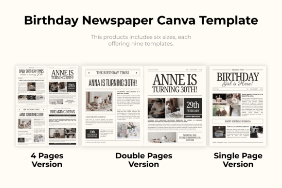
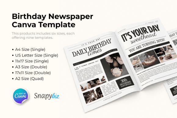
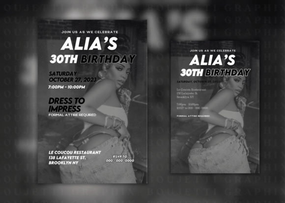
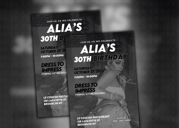
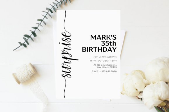
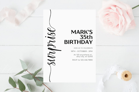
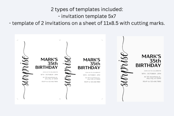
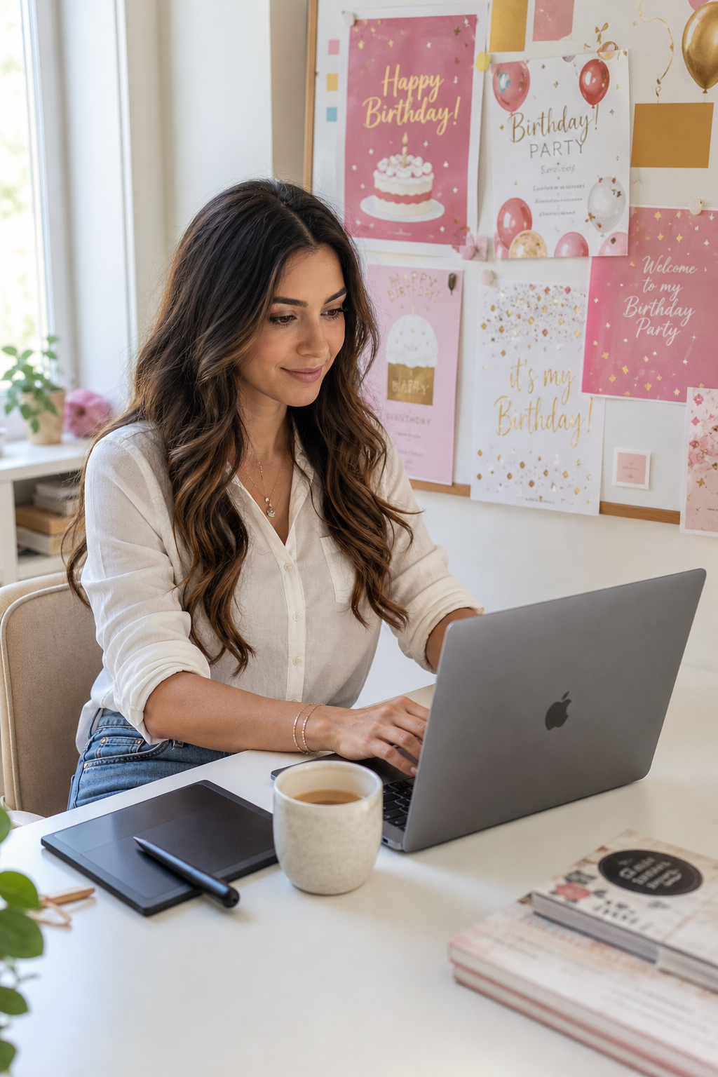
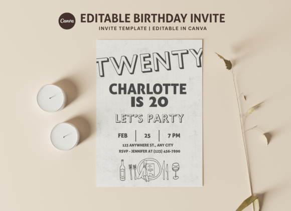
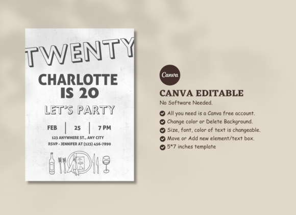
Quick answer: A black and white aesthetic birthday works best when you commit to two things: strong typography (a serif or high-contrast display font) and consistent pattern use (stripes, damask, or botanical line art). Mix matte and gloss finishes for tactile depth. One printable template set handles invitations, table cards and favour tags in a single download.
Isn’t Black and White Just Boring?
No. That’s the misconception worth correcting before anything else.
Black and white fails when it’s treated as absence of colour rather than as a design system. A plain white invitation with black Arial text is boring. A white invitation with a high-contrast engraved serif, a single thick border, and a black wax seal isn’t. Same palette. Completely different result.
The difference is in the decisions: font weight, texture, finish, and negative space. This article covers each of those.
Which Black and White Style Works Best for a Birthday?
There are four distinct B&W directions for a birthday aesthetic. They’re not interchangeable — each suits a different age group and vibe:
| Style | Key visual | Best for | Font direction |
|---|---|---|---|
| Minimalist | Clean white with black type only | Adults, milestone birthdays | Geometric sans-serif (Futura, Montserrat) |
| Gothic / dark romantic | Black background, white serif type, floral line art | Teens, adults who like dark aesthetic | Engraved or high-contrast serif |
| Art deco | Strong geometric borders, gold accents optional | Milestone birthdays, 1920s themes | Display serif with tight tracking |
| Botanical line art | Fine white line drawings on black or vice versa | Feminine aesthetic, garden parties | Script or delicate serif |
Pick one direction and stay in it. Mixing minimalist and gothic on the same table creates visual noise, not variety.
How Do Typography and Pattern Work Together?
They need to do opposite jobs. If your typography is bold and heavy, your pattern should be fine and restrained. If your type is delicate script, the pattern can carry more visual weight.
The mistake is pairing a heavy display font with a busy damask pattern — they compete for the same space and both lose.
I once tried to use a high-contrast italic serif alongside a thick stripe pattern on a birthday banner. Printed it, looked at it, and could not read the name from two feet away. Switched to a clean gothic block font. Same stripe background. Completely legible. The font was the problem, not the pattern.
Three pairings that always work for B&W birthdays:
- Bold geometric sans + fine vertical stripe
- Engraved serif + botanical line art (roses, ferns)
- Heavy condensed uppercase + solid black background, white type only
Where Do Printable Templates Fit In?
They handle the hardest part — getting the typography and pattern relationship right without having to design from scratch. A good B&W template has the font, spacing, and pattern already balanced. You change the name, date, and location, and export.
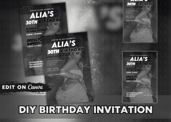
Each file below is a ready-to-edit or ready-to-print template from Creative Fabrica. Home printer on 90lb matte cardstock or send to a print shop — both work. Commercial licence included.